/* Custom style for animate.css. Lines 1-17 moved to frontend/_animate.scss */
@keyframes bounce {
from, 20%, 53%, 80%, to {
animation-timing-function: cubic-bezier(0.215, 0.610, 0.355, 1.000);
transform: translate3d(0,0,0);
}
40%, 43% {
animation-timing-function: cubic-bezier(0.755, 0.050, 0.855, 0.060);
transform: translate3d(0, -30px, 0);
}
70% {
animation-timing-function: cubic-bezier(0.755, 0.050, 0.855, 0.060);
transform: translate3d(0, -15px, 0);
}
90% {
transform: translate3d(0,-4px,0);
}
}
.bounce {
animation-name: bounce;
transform-origin: center bottom;
}
@keyframes flash {
from, 50%, to {
opacity: 1;
}
25%, 75% {
opacity: 0;
}
}
.flash {
animation-name: flash;
}
/* originally authored by Nick Pettit - https://github.com/nickpettit/glide */
@keyframes pulse {
from {
transform: scale3d(1, 1, 1);
}
50% {
transform: scale3d(1.05, 1.05, 1.05);
}
to {
transform: scale3d(1, 1, 1);
}
}
.pulse {
animation-name: pulse;
}
@keyframes rubberBand {
from {
transform: scale3d(1, 1, 1);
}
30% {
transform: scale3d(1.25, 0.75, 1);
}
40% {
transform: scale3d(0.75, 1.25, 1);
}
50% {
transform: scale3d(1.15, 0.85, 1);
}
65% {
transform: scale3d(.95, 1.05, 1);
}
75% {
transform: scale3d(1.05, .95, 1);
}
to {
transform: scale3d(1, 1, 1);
}
}
.rubberBand {
animation-name: rubberBand;
}
@keyframes shake {
from, to {
transform: translate3d(0, 0, 0);
}
10%, 30%, 50%, 70%, 90% {
transform: translate3d(-10px, 0, 0);
}
20%, 40%, 60%, 80% {
transform: translate3d(10px, 0, 0);
}
}
.shake {
animation-name: shake;
}
@keyframes headShake {
0% {
transform: translateX(0);
}
6.5% {
transform: translateX(-6px) rotateY(-9deg);
}
18.5% {
transform: translateX(5px) rotateY(7deg);
}
31.5% {
transform: translateX(-3px) rotateY(-5deg);
}
43.5% {
transform: translateX(2px) rotateY(3deg);
}
50% {
transform: translateX(0);
}
}
.headShake {
animation-timing-function: ease-in-out;
animation-name: headShake;
}
@keyframes swing {
20% {
transform: rotate3d(0, 0, 1, 15deg);
}
40% {
transform: rotate3d(0, 0, 1, -10deg);
}
60% {
transform: rotate3d(0, 0, 1, 5deg);
}
80% {
transform: rotate3d(0, 0, 1, -5deg);
}
to {
transform: rotate3d(0, 0, 1, 0deg);
}
}
.swing {
transform-origin: top center;
animation-name: swing;
}
@keyframes tada {
from {
transform: scale3d(1, 1, 1);
}
10%, 20% {
transform: scale3d(.9, .9, .9) rotate3d(0, 0, 1, -3deg);
}
30%, 50%, 70%, 90% {
transform: scale3d(1.1, 1.1, 1.1) rotate3d(0, 0, 1, 3deg);
}
40%, 60%, 80% {
transform: scale3d(1.1, 1.1, 1.1) rotate3d(0, 0, 1, -3deg);
}
to {
transform: scale3d(1, 1, 1);
}
}
.tada {
animation-name: tada;
}
/* originally authored by Nick Pettit - https://github.com/nickpettit/glide */
@keyframes wobble {
from {
transform: none;
}
15% {
transform: translate3d(-25%, 0, 0) rotate3d(0, 0, 1, -5deg);
}
30% {
transform: translate3d(20%, 0, 0) rotate3d(0, 0, 1, 3deg);
}
45% {
transform: translate3d(-15%, 0, 0) rotate3d(0, 0, 1, -3deg);
}
60% {
transform: translate3d(10%, 0, 0) rotate3d(0, 0, 1, 2deg);
}
75% {
transform: translate3d(-5%, 0, 0) rotate3d(0, 0, 1, -1deg);
}
to {
transform: none;
}
}
.wobble {
animation-name: wobble;
}
@keyframes jello {
from, 11.1%, to {
transform: none;
}
22.2% {
transform: skewX(-12.5deg) skewY(-12.5deg);
}
33.3% {
transform: skewX(6.25deg) skewY(6.25deg);
}
44.4% {
transform: skewX(-3.125deg) skewY(-3.125deg);
}
55.5% {
transform: skewX(1.5625deg) skewY(1.5625deg);
}
66.6% {
transform: skewX(-0.78125deg) skewY(-0.78125deg);
}
77.7% {
transform: skewX(0.390625deg) skewY(0.390625deg);
}
88.8% {
transform: skewX(-0.1953125deg) skewY(-0.1953125deg);
}
}
.jello {
animation-name: jello;
transform-origin: center;
}
@keyframes bounceIn {
from, 20%, 40%, 60%, 80%, to {
animation-timing-function: cubic-bezier(0.215, 0.610, 0.355, 1.000);
}
0% {
opacity: 0;
transform: scale3d(.3, .3, .3);
}
20% {
transform: scale3d(1.1, 1.1, 1.1);
}
40% {
transform: scale3d(.9, .9, .9);
}
60% {
opacity: 1;
transform: scale3d(1.03, 1.03, 1.03);
}
80% {
transform: scale3d(.97, .97, .97);
}
to {
opacity: 1;
transform: scale3d(1, 1, 1);
}
}
.bounceIn {
animation-name: bounceIn;
}
@keyframes bounceInDown {
from, 60%, 75%, 90%, to {
animation-timing-function: cubic-bezier(0.215, 0.610, 0.355, 1.000);
}
0% {
opacity: 0;
transform: translate3d(0, -3000px, 0);
}
60% {
opacity: 1;
transform: translate3d(0, 25px, 0);
}
75% {
transform: translate3d(0, -10px, 0);
}
90% {
transform: translate3d(0, 5px, 0);
}
to {
transform: none;
}
}
.bounceInDown {
animation-name: bounceInDown;
}
@keyframes bounceInLeft {
from, 60%, 75%, 90%, to {
animation-timing-function: cubic-bezier(0.215, 0.610, 0.355, 1.000);
}
0% {
opacity: 0;
transform: translate3d(-3000px, 0, 0);
}
60% {
opacity: 1;
transform: translate3d(25px, 0, 0);
}
75% {
transform: translate3d(-10px, 0, 0);
}
90% {
transform: translate3d(5px, 0, 0);
}
to {
transform: none;
}
}
.bounceInLeft {
animation-name: bounceInLeft;
}
@keyframes bounceInRight {
from, 60%, 75%, 90%, to {
animation-timing-function: cubic-bezier(0.215, 0.610, 0.355, 1.000);
}
from {
opacity: 0;
transform: translate3d(3000px, 0, 0);
}
60% {
opacity: 1;
transform: translate3d(-25px, 0, 0);
}
75% {
transform: translate3d(10px, 0, 0);
}
90% {
transform: translate3d(-5px, 0, 0);
}
to {
transform: none;
}
}
.bounceInRight {
animation-name: bounceInRight;
}
@keyframes bounceInUp {
from, 60%, 75%, 90%, to {
animation-timing-function: cubic-bezier(0.215, 0.610, 0.355, 1.000);
}
from {
opacity: 0;
transform: translate3d(0, 3000px, 0);
}
60% {
opacity: 1;
transform: translate3d(0, -20px, 0);
}
75% {
transform: translate3d(0, 10px, 0);
}
90% {
transform: translate3d(0, -5px, 0);
}
to {
transform: translate3d(0, 0, 0);
}
}
.bounceInUp {
animation-name: bounceInUp;
}
@keyframes fadeIn {
from {
opacity: 0;
}
to {
opacity: 1;
}
}
.fadeIn {
animation-name: fadeIn;
}
@keyframes fadeInDown {
from {
opacity: 0;
transform: translate3d(0, -100%, 0);
}
to {
opacity: 1;
transform: none;
}
}
.fadeInDown {
animation-name: fadeInDown;
}
@keyframes fadeInLeft {
from {
opacity: 0;
transform: translate3d(-100%, 0, 0);
}
to {
opacity: 1;
transform: none;
}
}
.fadeInLeft {
animation-name: fadeInLeft;
}
@keyframes fadeInRight {
from {
opacity: 0;
transform: translate3d(100%, 0, 0);
}
to {
opacity: 1;
transform: none;
}
}
.fadeInRight {
animation-name: fadeInRight;
}
@keyframes fadeInUp {
from {
opacity: 0;
transform: translate3d(0, 100%, 0);
}
to {
opacity: 1;
transform: none;
}
}
.fadeInUp {
animation-name: fadeInUp;
}
@keyframes lightSpeedIn {
from {
transform: translate3d(100%, 0, 0) skewX(-30deg);
opacity: 0;
}
60% {
transform: skewX(20deg);
opacity: 1;
}
80% {
transform: skewX(-5deg);
opacity: 1;
}
to {
transform: none;
opacity: 1;
}
}
.lightSpeedIn {
animation-name: lightSpeedIn;
animation-timing-function: ease-out;
}
@keyframes rotateIn {
from {
transform-origin: center;
transform: rotate3d(0, 0, 1, -200deg);
opacity: 0;
}
to {
transform-origin: center;
transform: none;
opacity: 1;
}
}
.rotateIn {
animation-name: rotateIn;
}
@keyframes rotateInDownLeft {
from {
transform-origin: left bottom;
transform: rotate3d(0, 0, 1, -45deg);
opacity: 0;
}
to {
transform-origin: left bottom;
transform: none;
opacity: 1;
}
}
.rotateInDownLeft {
animation-name: rotateInDownLeft;
}
@keyframes rotateInDownRight {
from {
transform-origin: right bottom;
transform: rotate3d(0, 0, 1, 45deg);
opacity: 0;
}
to {
transform-origin: right bottom;
transform: none;
opacity: 1;
}
}
.rotateInDownRight {
animation-name: rotateInDownRight;
}
@keyframes rotateInUpLeft {
from {
transform-origin: left bottom;
transform: rotate3d(0, 0, 1, 45deg);
opacity: 0;
}
to {
transform-origin: left bottom;
transform: none;
opacity: 1;
}
}
.rotateInUpLeft {
animation-name: rotateInUpLeft;
}
@keyframes rotateInUpRight {
from {
transform-origin: right bottom;
transform: rotate3d(0, 0, 1, -90deg);
opacity: 0;
}
to {
transform-origin: right bottom;
transform: none;
opacity: 1;
}
}
.rotateInUpRight {
animation-name: rotateInUpRight;
}
/* originally authored by Nick Pettit - https://github.com/nickpettit/glide */
@keyframes rollIn {
from {
opacity: 0;
transform: translate3d(-100%, 0, 0) rotate3d(0, 0, 1, -120deg);
}
to {
opacity: 1;
transform: none;
}
}
.rollIn {
animation-name: rollIn;
}
@keyframes zoomIn {
from {
opacity: 0;
transform: scale3d(.3, .3, .3);
}
50% {
opacity: 1;
}
}
.zoomIn {
animation-name: zoomIn;
}
@keyframes zoomInDown {
from {
opacity: 0;
transform: scale3d(.1, .1, .1) translate3d(0, -1000px, 0);
animation-timing-function: cubic-bezier(0.550, 0.055, 0.675, 0.190);
}
60% {
opacity: 1;
transform: scale3d(.475, .475, .475) translate3d(0, 60px, 0);
animation-timing-function: cubic-bezier(0.175, 0.885, 0.320, 1);
}
}
.zoomInDown {
animation-name: zoomInDown;
}
@keyframes zoomInLeft {
from {
opacity: 0;
transform: scale3d(.1, .1, .1) translate3d(-1000px, 0, 0);
animation-timing-function: cubic-bezier(0.550, 0.055, 0.675, 0.190);
}
60% {
opacity: 1;
transform: scale3d(.475, .475, .475) translate3d(10px, 0, 0);
animation-timing-function: cubic-bezier(0.175, 0.885, 0.320, 1);
}
}
.zoomInLeft {
animation-name: zoomInLeft;
}
@keyframes zoomInRight {
from {
opacity: 0;
transform: scale3d(.1, .1, .1) translate3d(1000px, 0, 0);
animation-timing-function: cubic-bezier(0.550, 0.055, 0.675, 0.190);
}
60% {
opacity: 1;
transform: scale3d(.475, .475, .475) translate3d(-10px, 0, 0);
animation-timing-function: cubic-bezier(0.175, 0.885, 0.320, 1);
}
}
.zoomInRight {
animation-name: zoomInRight;
}
@keyframes zoomInUp {
from {
opacity: 0;
transform: scale3d(.1, .1, .1) translate3d(0, 1000px, 0);
animation-timing-function: cubic-bezier(0.550, 0.055, 0.675, 0.190);
}
60% {
opacity: 1;
transform: scale3d(.475, .475, .475) translate3d(0, -60px, 0);
animation-timing-function: cubic-bezier(0.175, 0.885, 0.320, 1);
}
}
.zoomInUp {
animation-name: zoomInUp;
}
@keyframes slideInDown {
from {
transform: translate3d(0, -100%, 0);
visibility: visible;
}
to {
transform: translate3d(0, 0, 0);
}
}
.slideInDown {
animation-name: slideInDown;
}
@keyframes slideInLeft {
from {
transform: translate3d(-100%, 0, 0);
visibility: visible;
}
to {
transform: translate3d(0, 0, 0);
}
}
.slideInLeft {
animation-name: slideInLeft;
}
@keyframes slideInRight {
from {
transform: translate3d(100%, 0, 0);
visibility: visible;
}
to {
transform: translate3d(0, 0, 0);
}
}
.slideInRight {
animation-name: slideInRight;
}
@keyframes slideInUp {
from {
transform: translate3d(0, 100%, 0);
visibility: visible;
}
to {
transform: translate3d(0, 0, 0);
}
}
.slideInUp {
animation-name: slideInUp;
}
{"content":[{"id":"8e94176","elType":"section","settings":{"content_width":{"unit":"px","size":740},"gap":"wider","custom_height":{"unit":"vh","size":100},"content_position":"middle","background_background":"video","background_video_link":"https:\/\/youtu.be\/DsYNaw4qoJw","background_overlay_background":"classic","background_overlay_color":"#000000","background_overlay_color_b":"#9d56c9","background_overlay_gradient_angle":{"unit":"deg","size":270},"padding":{"unit":"px","top":"0","right":"0","bottom":"0","left":"0","isLinked":false},"background_overlay_opacity":{"unit":"px","size":0.29},"height":"min-height","custom_height_mobile":{"unit":"vh","size":100},"background_video_fallback":{"url":"https:\/\/library.elementor.com\/wp-content\/uploads\/2018\/05\/background-Fallback-404.1.jpg","id":8572}},"elements":[{"id":"6e18aaf6","elType":"column","settings":{"_column_size":100,"_inline_size":null,"padding_mobile":{"unit":"px","top":"15","right":"15","bottom":"15","left":"15","isLinked":true}},"elements":[{"id":"36333044","elType":"widget","settings":{"title":"404","header_size":"p","align":"center","title_color":"#ffffff","typography_typography":"custom","typography_font_size":{"unit":"px","size":249},"typography_font_weight":"bold","typography_font_size_tablet":{"unit":"px","size":200},"typography_font_size_mobile":{"unit":"px","size":160}},"elements":[],"widgetType":"heading"},{"id":"737f2c7b","elType":"widget","settings":{"title":"The page you were looking for couldn't be found","header_size":"h3","align":"center","title_color":"#ffffff","typography_typography":"custom","typography_font_size":{"unit":"px","size":39},"typography_font_weight":"300","typography_text_transform":"capitalize","typography_font_size_tablet":{"unit":"px","size":40},"typography_font_size_mobile":{"unit":"px","size":20},"typography_line_height_tablet":{"unit":"px","size":50},"typography_line_height_mobile":{"unit":"px","size":25}},"elements":[],"widgetType":"heading"},{"id":"7fe5f44","elType":"widget","settings":{"icon":"fa fa-font-awesome","primary_color":"#ffffff","_margin":{"unit":"px","top":"60","right":"0","bottom":"60","left":"0","isLinked":false},"size":{"unit":"px","size":60},"_margin_mobile":{"unit":"px","top":"25","right":"0","bottom":"25","left":"0","isLinked":false}},"elements":[],"widgetType":"icon"},{"id":"62b0497c","elType":"widget","settings":{"icon_list":[{"text":"Home Page","icon":"fa fa-angle-right","_id":"f9100b7","link":{"url":"","is_external":"","nofollow":""}},{"text":"Services","icon":"fa fa-angle-right","_id":"6e554ae","link":{"url":"","is_external":"","nofollow":""}},{"text":"About","icon":"fa fa-angle-right","_id":"0816417","link":{"url":"","is_external":"","nofollow":""}},{"text":"Blog","icon":"fa fa-angle-right","_id":"d8c317a","link":{"url":"","is_external":"","nofollow":""}},{"text":"Contact Us","icon":"fa fa-angle-right","_id":"123a835","link":{"url":"","is_external":"","nofollow":""}}],"space_between":{"unit":"px","size":13},"icon_color":"#ffffff","text_indent":{"unit":"px","size":10},"icon_typography_typography":"custom","icon_typography_font_size":{"unit":"px","size":16},"_margin":{"unit":"px","top":"30","right":"0","bottom":"0","left":"0","isLinked":false},"view":"inline","icon_align":"center","text_color":"#ffffff","icon_typography_font_weight":"500","icon_typography_text_transform":"uppercase","icon_typography_font_size_tablet":{"unit":"px","size":16},"icon_typography_font_size_mobile":{"unit":"px","size":14},"icon_typography_line_height_mobile":{"unit":"px","size":29}},"elements":[],"widgetType":"icon-list"}],"isInner":false}],"isInner":false}],"page_settings":[]}
The post Why Mystake is Stirring the UK Gaming Scene first appeared on DigiMarCon Latam- Digital Marketing, Media and Advertising Conference & Exhibition.
]]>Last month, a new version of the Mystake app went live, adding a “live casino” mode that streams from a studio in Las Vegas. The update came with a 30‑day free play period for UK players, which immediately drew attention from the betting community. As someone who has logged into several sites, I decided to test the new features and see how they stack up against the usual suspects.
At its heart, Mystake is a hybrid platform that blends traditional casino games with sports betting. In the UK version, you can find:
All of these come with a mobile‑first interface, so the experience feels the same whether you’re on a phone or a laptop. The new live casino feature streams at 1080p, and the latency is under 150 ms for most users in the UK.
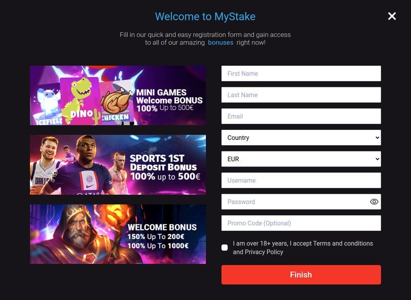
Signing up is straightforward. You create an account with a username, password and a UK postcode. Once you verify your email, you can log in using the mystake login button on the homepage. The real kicker is the mystake promo code “UKWELCOME10,” which gives a 10 % bonus on your first deposit up to £200. The code is valid for 30 days, so you have a good window to test the platform without pressure.
Deposits via UK‑based Visa or MasterCard are instant. For crypto, the processing time is 5–10 minutes. Withdrawals are where the site shows its true character: a standard £30 minimum can be processed within 24 hours for bank transfers, but the first withdrawal after the initial deposit can take up to 72 hours. For players who prefer speed, the mystake bet feature allows you to place instant wagers on live events, with payouts credited within 48 hours.
The first advantage is the breadth of game selection. With 200+ slots and a robust live‑casino library, there’s little chance of boredom. Secondly, the “live chat support” is available 24/7 and can resolve issues in under five minutes on average. Finally, the bonus structure is generous: a 10 % match on the first deposit and a 5 % cashback on losses every month if you hit the minimum stake of £50.
While the platform is strong, it has its shortcomings. The withdrawal lag of up to 72 hours can be frustrating for players who rely on quick cashouts. Additionally, the site’s mobile app is still under development; the iOS version crashes when you try to launch the live dealer rooms. Finally, the bonus terms require a 30× wagering requirement on the bonus amount, which is higher than the industry average of 20–25×.
Using the promo code “UKWELCOME10” on a £100 deposit gives you an extra £10. To claim the bonus, you must place bets totaling £300 before you can withdraw the bonus money. That’s 30× the bonus amount, so if you’re a casual player, you might find it a bit restrictive. However, for high‑rollers who can comfortably meet the requirement, it’s a worthwhile addition.
If you enjoy a mix of casino and sports betting, and you’re comfortable with the longer withdrawal times, Mystake offers a solid experience. The live casino feature is a standout, and the UK‑specific bonus code makes the first deposit feel like a small gift. On the flip side, if you’re a player who needs instant withdrawals or prefers a more streamlined app, you might want to explore other options.
Mystake Casino UK is carving out a niche by combining a wide game library with sports betting under one roof. The recent update to the live casino, coupled with a generous welcome bonus, makes it a compelling option for UK players who are looking for variety. The main drawback is the withdrawal speed, but for those who can wait a day or two, the experience is smooth and well worth the effort.
For a different kind of escape, consider visiting walkyourtalkretreats.co.uk to unwind after a long gaming session.
Mystake blends a traditional casino with a live studio‑streamed casino, offering real‑time dealer interactions and a 30‑day free play period for UK users.
Simply visit the official site, click “Login,” and enter your registered email and password or use the single‑click login feature.
Yes, new UK players can use the promo code “UKMYSTAKE” during registration to unlock bonus credits.
Mystake accepts major UK cards, PayPal, Skrill, Neteller, and instant bank transfers.
The post Why Mystake is Stirring the UK Gaming Scene first appeared on DigiMarCon Latam- Digital Marketing, Media and Advertising Conference & Exhibition.
]]>